NIKE+ FUELBAND – 2-YEAR PROCESS SUMMARY
I was one of the few designers who lasted the entirety of this unusual project — from the pitch in 2011 to the launch in 2014.
779 decks. 2 iPhone updates. 3 designer shoot-outs. 4 designers.
At a time before fitness trackers flooded the market, our team was sealed off in a confidential area of the agency to work non-stop for two years on many iterations of what would be Nike+ FuelBand. No detail was left undone, including many of the un-glamorous pages which are not featured here (Settings, Email, Software Connections, etc.).
Please keep in mind this is an extremely brief summary for the amount of work that went into this.
Role: Senior Designer / AD
Winner of the 2012 Cannes Lions Titanium Grand Prix
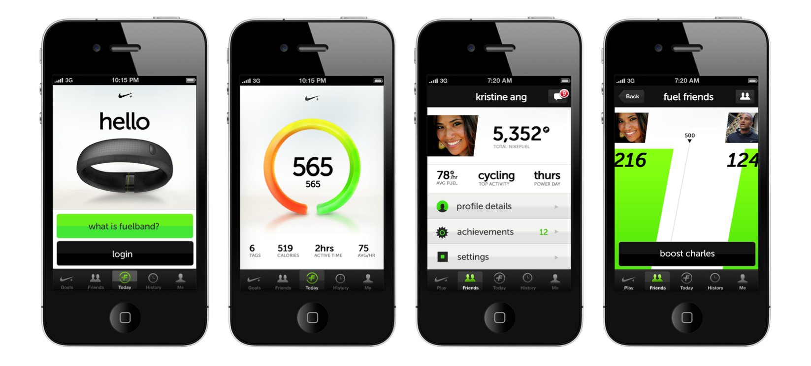
INITIAL DESIGN EXPLORATIONS FOR MOBILE:




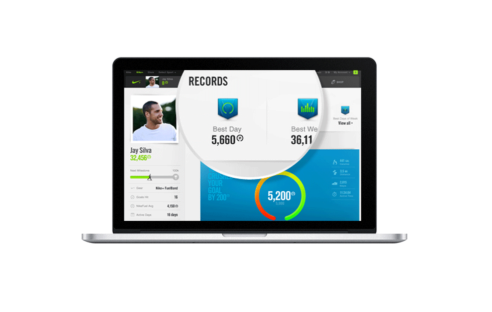
NIKE+ WEB - LOGGED IN
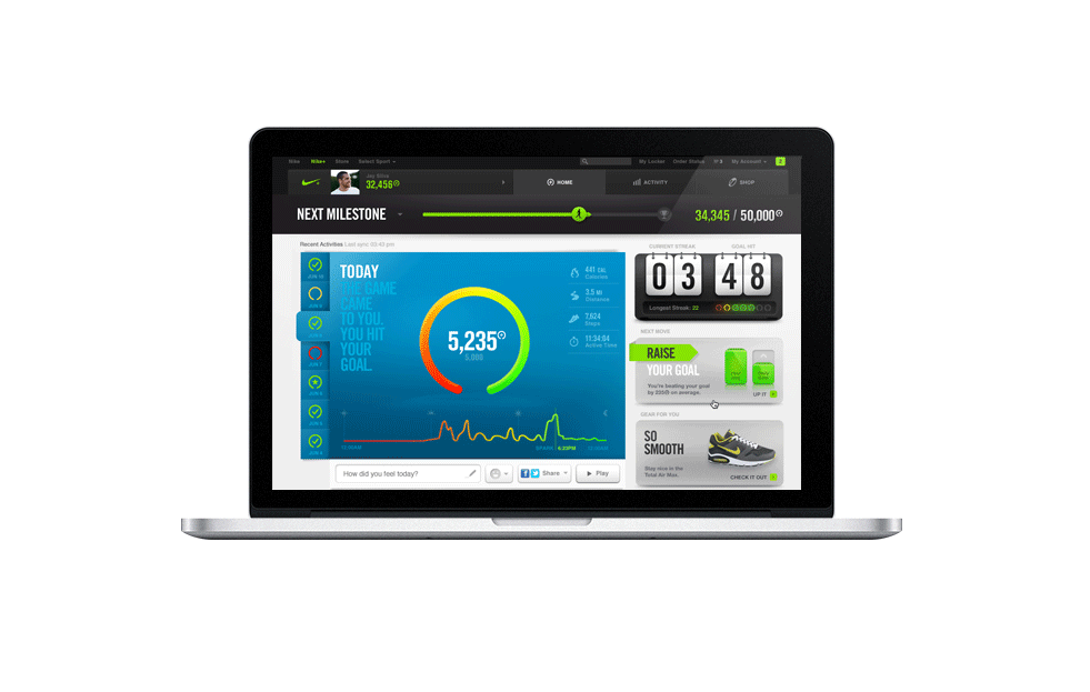
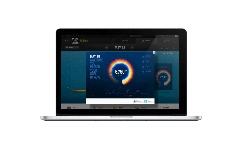
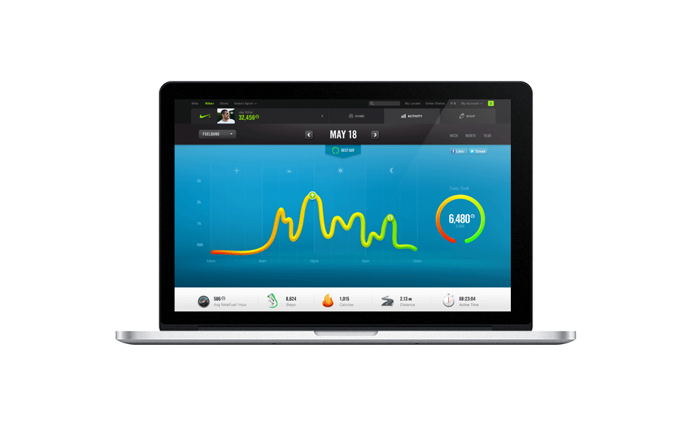
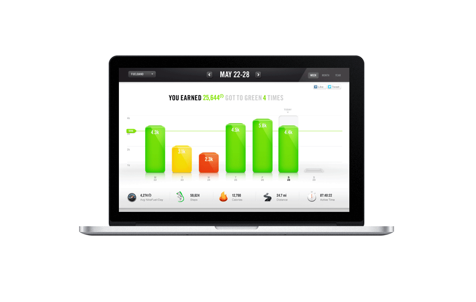
After beginning our concepts in mobile, we began our desktop designs. Below is a slideshow tour of what a user might see when they begin logging data. (Designs for version 1.0).
FOR MORE INSIGHT ON THE LARGER PROCESS & STRATEGY,
BELOW IS THE VIDEO OVERVIEW (3 MINS):
PROFILE PAGE


